The color or colors that you pick for interior painting for your home is very important. Colors are key in creating different emotions and sensations, some might be sad, and other colors might be cheery. This is why it’s so important for you to use the colors according to the particular profile that you might want to give a certain room or rooms and then you can use your accessories and furniture to combine with the color scheme.
We realize that there are a tremendous amount of different colors on the market to choose from so that’s why we’re here to help with that decision making. Here, we’ll give you a list of favorites by companies like Sherwin-Williams and Pantone as well as what seems to be trending currently. We hope that this will give you ideas and help make your decision easier. We will suggest the colors in color palettes to give you an idea of color combos as well.
Gray, Beige, and Old Rose
This color palette is called Manta and its goal is to try and represent Japanese minimalism and even s Scandinavian design for your home. It contains tones that have been inspired by materials that are natural, and it’s a balanced palette of both warm and cold tones, it’s also very relaxing and soft. It’s a palette that includes muted gray, soft roses tones, and beige. They are great colors for creating a very relaxing and/or quiet spaces.
Coral, Green, and Earth Tones
This is a unique palette that is a fusion of boho atmosphere mixed with a modern design. It results in a collection of colors that tend to harmonize quite well. From the silky earth tones to its soft corals, there are nine colors that all have a connection to comfort and pleasures you see in everyday life.
These tones combine quite will with any retro-inspired accessories and warm earthy finishes. This palette is warm and beautiful and is filled with light and neutrals.
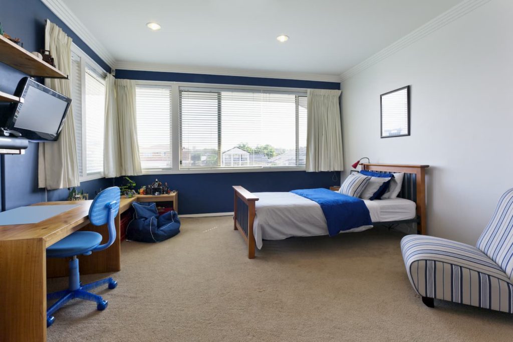
Browns and Blues
In this color palette you’ll find some neutral beige that are artistically combined with mustard, and rich blues that really accompany your daily life quite well while giving you a touch of nature and balance. They call this palette “Live”.
Roses, Mustard, and Bluish Greens
This particular color palette is great for a person who is energetic and passionate about life, so no wonder they named it “Play”.
All the colors contained in this palette is an invitation to play and have fun. It’s both intelligent and energetic and it also can add a lot of charm to a room. Add it to a fresh and pure white and you’ll have amazing bursts of vibrant colors. Its goal is to add a little bit of warmth and good humor. These colors help to remind us all that we’re still kids at heart who still love to play.
You can add touches of color, if it’s through a sofa, decorative walls, or artwork is perfect for those who don’t want to take themselves all that serious. The colors are all about getting away from the stress of life and to have a good time, laugh, and play again. The fuchsia, gold tones, and aquamarine all add a touch of warmth and joy to any space.
Green, Beige, and Yellow
This particular color palette is ideal for anyone who is looking for the feeling of an oasis. It’s been inspired by the different seasonal cycle of our planet and it gives a subtle rich tone of the sea, forest, sky, and sand. No wonder the palette is called “Heaven”. It’s all about bringing the “organic” inside of your home.
Blues
Some of the more popular blues right now are klein blue, navy blue, light blue cake, and different blue blends.
With klein blue any space can also utilize the primary colors of red, blue, and yellow. This means you can do this through paints, furniture, and/or accessories.
Navy blue is a great color to bring out the colors of the ocean by combining it with natural wood as well as a mint green to highlight the blue.
The light blue cake color is a “blue-blue” that’s an aged tone and it brings a lot of serenity to a space. This is why it’s very popular to use in adult bedrooms or in any room where you may want to create a very peaceful environment.
When you don’t feel that a single color is enough, you may want to use different tones of that same color. This is why blue blends will work quite well. This is because it can be used in friezes, moldings and other kinds of finishes in any shade of blue that’s different from the blue walls.
Greens
There are a lot of different shades of green. In recent years trends seem to be leaning toward the more natural and earthy tones such as sage, celery, and avocado leaves tones.
A bluish green can be used for a decorative accent as well as an entire wall. You can even add different shades of orange as an accent color. This can be the perfect combination of colors when you add gray or beige furniture or accessories.
Another great color combination is beige and mint green. These together help to create a very peaceful space for your home.
Blue and green combined together in a room works well with black and white accessories and in turn, the blue and green look perfectly in harmony with each other.